WE'VE MOVED!

WAIT, NO. HIDE SOMEWHERE ELSE!

Starting February 2014 this blog will be out of action.

But DO NOT DESPAIR. We've just moved, and you can still find the same riveting and informative posts that you have come to expect on our new blog:

Wednesday, December 26, 2012

Merry (Day After) Christmas!

Hope you survived the Holidays!  


Every other year I try to make a Christmas card. Some years it gets away from me though, and I just can't seem to get to it. This was one of those years.

So, since I failed miserably, (and since I have never posted this online) I am posting this card I made for Christmas 2005. It depicts a heart-warming situation where everyone got just what they wanted for Christmas. Well, most everyone anyway.

Enjoy, and hope you had a wonderful holiday wherever you were!

Tuesday, November 13, 2012

Illuxcon Treasure!


Drive-by post today!  I just got back from Illuxcon.  As always, it was an immensely rewarding convention and one from which I always leave tremendously humbled and inspired. And like most who attend, I also leave with a sense that I just can't wait to get back to the studio and start painting again. I can't wait to try out new techniques and start on new ideas.

But the best part of this year's Illuxcon for me was picking up this amazing little gem from Omar Rayyan:


Omar has long been one of my favorite illustrators.  I love his work for its lively brushwork, its wonderful sense of humor, and for just the sheer charm of his characters.

I knew as soon as I saw this one at his booth that I was going to be walking out of the show with less money.  The new tires? Fixing the broken washing machine? Meh, those can wait. I knew that what I really needed to do is put this on my wall as soon as possible.

It was a great show. If you haven't been to Illuxcon, you should try to get out there and see it.

----

In other news tonight:
As of this writing, The Lamppost Guild Kickstarter has reached $27,000! It's been amazing and I am really looking forward to getting the courses out there and into everyone's hands.

Also, if the kickstarter reaches $30,000 by tomorrow night they will be adding a new marketing course to the line-up. To learn more check them out at: http://www.kickstarter.com/projects/pathwrightpress/the-lamp-post-guild

Tuesday, October 30, 2012

What's in a Title?


This is an excellent painting. The lighting, the composition, the execution, they are all excellent.  I look at it and don't know what is going on exactly, but I love it. I want to know more about it. I want to know what compelled the painter to make this image.
So I look at the title.

The title is "The Old Shepherd's Cheif Mourner," painted by Edwin Henry Landseer.
I enjoyed the technical excellence of the painting, but it wasn't until I read the name that I truly appreciated the painting's narrative excellence as well.
I look at the painting again, and now the dog's face takes on a sense of loss that is heartbreaking. Layers and layers of story now begin to unfold around the image for me.

Most of the time I dismiss titles as unnecessary nonsense by which lazy artists prop up technically inferior work because it lacks the ability to stand on its visual merits alone.

And it is true that in the past there have been instances where artists have taken a shortcut to applause by coming up with names for their work that sound fashionable or hyper-intellectual.

There have also been hapless artists who just wanted to paint something simple, like a lake, because it made them happy, but who then felt compelled to add some title implying that the image is really a statement on the post-industrial consumerism or the plight of the proletariat in eastern bulgaria or some fashionable elitist cause. All because they were afraid of their work as being labeled sentimental or anti-intellectual because it was representational and wasn't shocking.

This appreciation of psuedo-intellectual titles seems to have fallen away somewhat in the past few years. (I personally thank Frank Frazetta and video games for this)

There even exist online name generators to lampoon the whole idea of this sort of naming.
Consider http://noemata.net/pa/titlegen/ which will generate three pieces of abstract art at random, all with suitable titles.


However, this cultural reaction against fancy names has its drawbacks. And that is that we may forget the great value in a title.  I certainly do. In my efforts to avoid trying to sound pretentious I generally name my work something like: Painting #2, Monster #15, George Washington Field-Tackling a Bear #34 and so on.

But there is a classical use for titles. And that is to take an image that is already technically excellent on its visual merits alone, and then provide the viewer with further context and insight into it.

"The Old Shepherd's Cheif Mourner" is an excellent example of how a name can add to an image, and not be a replacement for technical excellence in one.

-----

Lamp Post Guild Update:

Good news! In spite of my false promises involving domesticated camelid mammals, we somehow managed to meet our financial goal in the first 24 hours! So now the Guild is stretching its initial goals and is expandeding its course line-up.
To see what's happening check out: http://www.kickstarter.com/projects/pathwrightpress/the-lamp-post-guild


Tuesday, October 16, 2012

LlamaGate 2012

Excerpt from The Post Gazette, Oct. 10, 2012:

"In the wake of what is being called "The Llamagate Scandal," Justin Gerard's office has released the following:

"I want to apologize to everyone for the statements I made last week. I made some very foolish and insensitive promises involving llamas. It was childish and negligent. To all my fans and those who have supported me, I extend my sincerest apologies. 


 And to Llama-herders everywhere: I am sorry." 


Justin's original statements were met with a flood of outrage and confusion as media outlets everywhere scrambled to make sense of it. A long-time fan who preferred to remain anonymous said, "I just, I just can't believe he would promise a llama."

A local llama-herder said Mr. Gerard's statements were "downright spiteful and mean-spirited," and speculated that Mr. Gerard may not have a soul.
Meanwhile, the National Association of Goat Owner's praised Mr. Gerard's statements as "groundbreaking" and "honest," adding that "llamas are overrated anyway."

Mr. Gerard's office was not available for any further comment when contacted by this news agency."

For more on Llamagate 2012, please see http://quickhidehere.blogspot.com/2012/10/online-illustration-courses.html.


----

Guys, it was an honest mistake. I wanted to generate some hype for this online course and so I made a few reckless promises. I mean, who hasn't these days?

As a means to make it up, I have drawn for you this Luminous Golden Llama:


Also I have news on The Lamp Post Guild!
Today the Guild is launching its Kickstarter campaign for its interactive courses. These courses are super in-depth and will offer a lot of step-by-step tutorials and lessons for you to take at your own pace. We are really excited about the possibilities of these. (I would have killed for something like this in college.)

My course will be on illustration.  From thumbnail to final color image.
My dual course on "How to bake the perfect chocolate-chip cookie and Survive an International Scandal," is unfortunately not ready to launch at this time.

Pledges will receive early access to the courses as well as a variety of other oddities ranging from digital wallpapers to original oil paintings.


Check it out at www.LampPostGuild.com.


Tuesday, October 09, 2012

Online Illustration Courses


I have finally gotten around to doing some online illustration courses. Now, for the millions of you who have written me clamoring for a course on how I make the perfect chocolate-chip cookie, I'm sorry, but you will have to wait.

In the meantime though, I am working on an in-depth course on illustration through the Lamp Post Guild. The course will be super in depth and will offer demos and step-by-step lessons which you will complete at your own pace.  I will also personally give you a llama.

In my day, art education had largely to do with stealing books from libraries, or abducting experts and holding them at gunpoint until they told you everything. It was not unlike working with the mafia.  Except we were after art training, and we didn't go in for silly hats.
Today, using the magic of the world wide web, we no longer need to use guns, threats of violence or even money laundering to get an art education.
It's actually quite exciting how things have come along.  Sure, we will miss the smell of cordite and gun oil after a long day of learning, but overall I think it is progress.

If you are interested, follow twitter.com/lamppostguild for updates.


*Note - I was kidding about the llama.  Please don't ask me for a llama if you see me at a show.  I will not give you a llama.  


Thursday, October 04, 2012

Rembrandt and Dirty Tricks

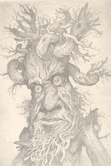
I will now show you a trick I stole from Rembrandt when he wasn't looking.


I begin with an extremely tight drawing, paying careful attention to the lines and proportions and expression.  I spend months and months of meticulous, precise draftsmanship to achieve the desired design.


I then destroy all of that and apply thick coats of paint like I am on fire. I also make sure to mangle the color. 

I then eat my drawing, fall into a deep depression and curl up under the table and weep while playing recordings of whales and sounds from outer space.  

Finally, I take a lousy digital photo of the painting. If there is one thing I am good at, it is taking lousy digital photos.


This is where Rembrandt's tricks come in.  Rembrandt had a curious habit of stopping a piece that was giving him trouble midway through and doing small studies of his painting to try and fix the issues that were troubling him. By doing this he could light his way forward without further savaging his painting. (see Rembrandt The Painter at Work from University of California Press for more on this.)

In my case here, I began to have doubts about my initial direction with color. I had originally been thinking the orange and green of mid day, but as I got into the painting I felt more and more like I really wanted this to be at night. So instead of possibly wrecking everything and having to rework it later, I took a digital photo, (HA! bet you wish you had one of these Ernst) after which I then applied a quick treatment of color in Photoshop (my native tongue).  This new comp, based on my current painting, is then used to guide me through to the finish and prevent me from losing my mind or trying to eat my own hands. 


"Ent"
 12" x 16"
Oil on Masonite

I hope Rembrandt will forgive me for this little thievery.

PS: For those of you wondering about the goats...  Here, this is what actually happened:
http://www.youtube.com/watch?v=2gvhTur_9co&feature=youtu.be


Thursday, September 20, 2012

Character in Dragons

I have always loved dragons. 


And I have always loved dinosaurs.  


But dragons are not dinosaurs.

While I love studying the creatures of this world for clues on how to make a fantastic creature feel like they could exist in it, I think that by making dinosaurs and dragons altogether interchangeable in our work, we are giving up on all the possibilities which each contains individually and for which they have been historically used in fantasy.


Tolkien makes a compelling case for a distinction between dragons and dinosaurs in his essay, On Faerie Stories:

I was introduced to zoology and palaeontology (“for children’') quite as early as to Faerie. I saw pictures of living beasts and of true (so I was told) prehistoric animals. I liked the “prehistoric” animals best: they had at least lived long ago, and hypothesis (based on somewhat slender evidence) cannot avoid a gleam of fantasy. But I did not like being told that these creatures were “dragons.” I can still re-feel the irritation that I felt in childhood at assertions of instructive relatives (or their gift-books) such as these: “snowflakes are fairy jewels,” or “are more beautiful than fairy jewels”; “the marvels of the ocean depths are more wonderful than fairyland.” 
Children expect the differences they feel but cannot analyse to be explained by their elders, or at least recognized, not to be ignored or denied. I was keenly alive to the beauty of “Real things,” but it seemed to me quibbling to confuse this with the wonder of “Other things.” I was eager to study Nature, actually more eager than I was to read most fairy- stories; but I did not want to be quibbled into Science and cheated out of Faerie by people who seemed to assume that by some kind of original sin I should prefer fairy-tales, but according to some kind of new religion I ought to be induced to like science. Nature is no doubt a life-study, or a study for eternity (for those so gifted); but there is a part of man which is not “Nature,” and which therefore is not obliged to study it, and is, in fact, wholly unsatisfied by it.

-J.R.R Tolkien from On Faerie Stories


In Tolkien's own Smaug, the dragon offers more than just a physical threat of violence, he offers a personification of greed (and a distinctly aristocratic greed, which refuses to share or recirculate wealth, that only consumes and consumes and keeps it in dark halls, leading to the ruin of the nation.)  

In John Gardner's Grendel, the Dragon is even more a philosophical threat over a physical one. The dragon reveals a set of philosophical beliefs to Grendel, and it is these that Grendel wrestles with, and is ultimately overcome by. This leads him to choose to become, and even embrace his position as, the villain in the Shaper's story. The dragon in Grendel personifies a deeply nihilistic view of the world: his final arguments about the purpose of life being that all human values are baseless and that everything we do will be made irrelevant. His best advice to Grendel is to "seek out gold and sit on it."  As nothing really matters anyway.  
Gardner uses the imagery and the archetype of the dragon to convey how coldly-calcuating, threatening and dangerous the idea is, and this is belief is ultimately played out through Grendel's own final meeting with Beowulf.

This type of symbolism in dragons offers something far more than a struggle of man vs. nature. It does what fantasy does best, it offers physical examples of man's internal struggles. And offers us a wealth of other conflicts, both external and internal.  

If we agree that dragons in fantasy should be something more than just animals, that they have an intelligence equal to or greater than humans, then we should seek to imbue them with an equal amount of human personality. 

So consider your dragons.  What is really inside them and how can you show it on the outside?


Tuesday, September 18, 2012

Let's Draw Real-Life Dragons

Drawing from life is hard. 
And drawing from life that insists on being alive and wandering off or slithering away is even harder. 


But it can be highly rewarding as well. There is a wealth of information that you glean from direct observation that you just can't get any other way. Like that someone taught that miniature monkey over there how to make obscene gestures and he has been making them at me for the past ten minutes.
But also more useful things like how reptiles breath, how they interact with one another, how they act when they are startled, or how they sit with jaws open to cool off (and not in the hopes that I will carelessly step there.)


These drawings were done at a reserve called Alligator Adventure, in Myrtle Beach, South Carolina. This reserve is home to one of the largest crocodiles in the world, "Utan." (pictured above)
Utan is 20 feet long and weighs 1 ton.  He is in his own spacious exhibit, because he ate everything else.

He is a genuine monster, a horror from another age. In other places in the world his kind allegedly still kill more humans than any other predatory animal on the planet.

I doubt this chicken wire would really do much if he really decided he wanted to eat me, it looks like it's a screen door he might accidentally trip through on his way to the loo. But as you can see, I'm not worried at all. This is because I am wearing my sweet camo hat, which renders me pretty much invisible to him.


Here we got the head done, and then Utan decided he'd like a swim.  This was inconvenient, but you don't argue with 20 foot crocodiles.

So I moved on to the smaller lizards:


These juvenile alligators, like the juveniles of other species, could not sit still for more than 30 seconds. Drawing them proved fruitless.


Here we were able to catch a tail, and that is all.


Still there were fascinating tidbits that now get filed away for future projects on enormous, man-eating reptiles. How the water moves around them as they submerge is particularly fascinating.  


This alligator didn't like the way I was looking at him. That, or he didn't like my sweet camo hat. Either way, he eventually had enough and made a break for it.  But not before I snapped a photo which I would later use to cheat and fill in all the missing details.  Justin: 1, Alligator: 0


This guy knew that I knew that he knew that I knew that he was there and that he was NOT a log. I watched him slide into the water for crying out loud.  But that didn't stop him from slowly drifting up to the edge and pretending to be a log.  We all knew the game, and he knew that sooner or later, I would have to cross the water to get back to my car. And in my haste I'd forget that he wasn't a log.  And he'd even that score up a little.

But I knew a little secret called, "using the bridge."
Final Score: Justin: 2, alligator: 0


Thursday, August 30, 2012

Sketchbook 2012 Shipping Out!


Sketchbook 2012: Ents & Orcs ships out today!  
 The first 50 are individually numbered and have a personal drawing in them.  


#1 this year went to Dave from Kalamazoo, who managed to order in the first 15 seconds of it being live somehow. I believe that aliens were somehow involved. Dave isn't saying anything.  Either way, he will be getting a dragon. 


The sketches this year feature a lot of wizards, dragons, vikings, elves and as you might expect, a lot of Ents...


 ...and orcs. 

But there are also dwarves,


 And others of a less than savory nature...


As well as some old friends, 


And the Were-rabbit makes his return for #40:


If you haven't gotten one and are interested, there are still a few left on the Store.
And I will of course be selling them at DragonCon this weekend in Atlanta.  


Thanks again for all the orders and support! You guys are awesome. 

Tuesday, August 21, 2012

Sketchbook 2012: Ents & Orcs


Sketchbook 2012
9 x 6, 44 Pages, Full Color


Each year for the past few years I have been doing a new sketchbook based around one of my personal projects that I am engaged in at the time. Some previous examples are The Silver Age in 2010, and The St. George and Other Works in 2011, both of which were a a lot of fun for me.

This year, I am delving back into Tolkien. Specifically, I have been working on the struggle between the Ents and the Orcs from The Two Towers.  Apart from being some of Tolkien's most interesting characters, there is a dynamic that exists between Ents and Orcs that has always fascinated for me.


It is a curiously human relationship that seems to exist between these two distinctly non-human characters.  While they are constructions of fantasy, they offer a reflection of our own struggle to both master nature and at the same time care for it.


The Sketchbooks are going live today at 12 Noon EST and I will be selling them on my store HERE.  

All are signed, but as with last year, I will be doing drawings in the first 50 orders.
Click HERE to see how some of last year's first 50 turned out.

I will also be selling these at DragonCon in Atlanta later this month. Stop by and say hi if you happen to be out that way!

Tuesday, August 07, 2012

Dragon Watercolor and Final

Color Comp

Last time I posted a color comp and a few studies for a recent personal piece.  This is how the watercolor turned out:


 12" x 18" Watercolor on Bristol


As you can see, the watercolor is not nearly as intense as the color comp.  This is something I run into a lot when I do really saturated color comps.  I would like to say that it is a "feature" of my work, rather than a deficiency in my own ability, but I never plan for it.  Somewhere along the way I get taken in by the subtleties and then can't quite bring myself to take it further traditionally.  
Which is where the digital comes in:


Digital work over Watercolor 


The digital allows me to get a lot closer to that initial comp, while at the same time leaving the watercolor alone.  But this, like invading Russia before a winter, leads to its own set of problems. For one, things become more tedious.  In the initial color comp, you are pulled along by the joy of exploration.  There are still mysteries and borders never crossed in the world. But with our comp, we have already been there.  Now we are going back with magnifying lenses and little shovels and rock sampling kits.  It takes a different mindset for exploration. And while I usually love it, it's generally not as exciting as the initial comp for me.

I find that often the only time I ever get excited about a piece again, is after it is printed. Only then can I really judge wether a digitally modified piece has been a success or not.  The digital format can tell awful lies. Sometimes you need to get a piece into the light of physical reality before you can really know. 
Until then, like others whose armies got bogged down in Russia in the dead of winter, I am usually left second-guessing myself and wishing the final was a little closer to the original comp.   

---

In other news: I have been working on Sketchbook 2012.  Preview next week!

Tuesday, July 24, 2012

New Work for DragonCon 2012


So I have been busy working on some new imagery for DragonCon 2012.  I will have a booth there (as will fellow Muddy, Dan Dos Santos.)  If you will be attending stop by and say hello.

It will be my first year at the convention, and I want to make a good impression.
So I canned my original idea of Ninjas vs. Bears as being out of place for this event, and I went with something more traditional.  (I am not ruling out Ninjas vs. Bears for next year's Spectrum Live though.)

These are my studies for a more DragonCon-themed image.  This one continues the thread of; if I was a player in some fantasy story, I'd probably be the guy who made the really dumb mistake and got us all in a lot of trouble.
In this case, our hero is thinking, 'maybe this wasn't such a good idea after all,' as he tries to quietly draw his sword. The dragon has its head up, suddenly alert.

Next week: Watercolor and Final.


Tuesday, July 10, 2012

The Digital Silmarillion: Joining the Dark Side


So I know I said I wasn't planning on doing (or monkeying with) any of these Silmarillion pieces digitally.  But I gave in and joined the Dark Side for a bit to push the Glorfindel and the Balrog piece a little further.

I can't help it, sometimes I just have to monkey with the paintings.  This version of the image is much more like the frame that was in my head originally, with a little more emphasis put on the fire and atmosphere. Hopefully the digital work doesn't affect the overall classic feel I was going for in the original.  Having things turn out too synthetic looking is always a concern when painting in Photoshop.

In the end, I just love pushing the traditional parts further on the computer. Like the Dark Side, Photoshop can be a lot of fun to work in once you really figure it out.

But this is where it starts guys. One day your happily adjusting Photoshop dials, the next thing you know you've built a Deathstar and you're about to blow up Alderaan.

Tuesday, June 26, 2012

Billy Bones Character Design Process

Pencil Drawing, Watercolor, and then Watercolor and Digital

This was a brief experiment in working more opaquely than I usually do. (Both in the watercolor and in the digital.)  

The digital work is very minimal.  In CS5 it is just one Color Balance layer and a few normal layers. 

Usually I will use hundreds, nay thousands, of multiply and screen layers to finish even a simple character when I am working over a much lighter watercolor.
As for the brushes themselves, they were mostly Photoshop standards and a few pencil brushes of my own.  Nothing fancy since the traditional watercolor does most of the texture work.

I didn't do very well getting bright colors in the original watercolor.  But if I ever need to paint something so that it looks like a complete mess, then I am pretty confident that I will knock it out of the park.